Let me preface this post by saying that I am without a doubt the most fonty and colorful blogger you’ll ever meet. If it’s a downloadable font I’ve downloaded it. If it’s a color I’ve tried it. So, I come at this subject with more than just a little experience. Trust me, I’ve been there and I’ve done that.
This post is now available as part of a full ebook.
“Delicious Blogging” comes complete with 31 lessons, action-steps, and a companion workbook. You will quickly and easily learn how to blog.
Get your copy today and start creating a blog readers will love. BUY NOW
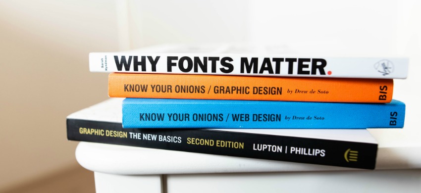
Fonts are a funny thing. They look so pretty and swirly and inviting. But, don’t be fooled. Fonts are little troublemakers in disguise. They are just waiting to wreak havoc on your site. Fonts are like Indy cars. You should be required to have a license AND special training to use them.
As you can deduce, I have strong feeling about fonts.
When you start a blog what do you want most? Did you say readers? If you did, you are right. You want people to read your blog.
But, if they can’t make out the words, what’s the use? Uhhh….there isn’t any.
Fonts may seem cool, however, they can distract from your writing and take away from the readers experience.
Here’s the deal. If you insist on using a special font, you need to make sure it’s readable on all screen sizes, from phones to tablets to computer screens. You need to be sure it shows up properly on all web browsers. Does it look the same in Chrome, Safari & Firefox?
Ask yourself, does it add value to my writing? Does it lend well to the flow of my ideas on the page? Does it compliment my tone and my message?
Remember, you’re first priority is your readers not your design ambitions. It’s not about you.
If you are using a font just for show, ditch it.
Now, I’m not saying you can’t use extra fonts, ever. I have set up my theme to use two Google fonts that are easy to read and embedded into my theme. I never need to go outside the main area to retrieve my fonts and I know that everyone can read them no matter what browser or platform they use to read my posts.
The rule of thumb to remember here is: Save the cool fonts for your pins and graphics. Fonts are most effective on eye-popping graphics. Maximum impact. Minimum fuss.

Now, to a word about color. I’m a color addict. I freely admit it. I like colorful blogs, when done tastefully. I also like beautiful, serene pastel blogs.
The thing to remember about color and blogs is that first, rainbows are so middle school. Rainbow colors are for notebooks and socks, not blogs.
Every blog should have 2 main colors. A passive color and an action color. A passive color is any hue that is used to emphasize an idea or a thought. An action color is anything you want your readers to click.
You need to pick two colors. They should compliment your blog. They should be colors that are easy to read. They should be the same every time.
You have a couple of choices here. You can use the pre-defined colors in the edit menu of the dashboard or you can choose your own color hex codes. These are the #xxxxxx numbers that define every color in the universe. My favorite place to find these codes is ColorHexa.com and The Hex Hub. Sometimes I start at The Hex Hub to find the code and then go to ColorHexa.com to find all the complimentary colors and hues.
One final note about colors. While it’s nice to have a light gray color for your main writing and it may match your blog really well, make sure it is readable and printable too. This is especially important if you write things people might like to print out such as how-to instructions.
Also, keep in mind that more and more people are reading your posts on mobile. If the color of the font is too light it will be difficult to read on small screens or outdoors.
There is a blogger who writes posts I love to read. The information is valuable to me and I like to make notes on some of her instructional writings. But printing out her posts to read offline doesn’t work. The printing is so light it doesn’t come through. Keep it dark, please.
When dealing with color these resources will help:
- Passive colors vs. Action colors
- Why color matters
- Color articles on Pinterest
- ColorHexa.com
- The Hex Hub

When in doubt think of fonts like icing. Too much icing makes everyone sick. Learn to use fonts well for a delightful reading experience.
Use color with intention. Make your colors work for you not against you. Use them to direct your readers to what you want them to click and take interest in.
Do you have questions? Need clarification? Please ask me in the comments. I’ll be happy to help.

Photo by Jeroen den Otter on Unsplash
Photo by Markus Spiske on Unsplash

Leave a Reply