Get To Know Your Subscribers With Revealing Reports In Mailchimp
You are amazing. You’ve come so far since we started this series and now you’ve got a ton of information to process and some great experience under your belt.
{Updated for 2019}
You are well on your way to mastering Mailchimp. But there are a few more areas you will want to know and understand so you can use Mailchimp with purpose and authority.
It doesn’t matter how many emails you are sending out if you aren’t tracking how your content is being received. You can learn a lot about your subscribers by looking at your campaign reports in Mailchimp.
Checking your stats regularly will help you be ready to make adjustments and ensure you are serving your readers each time you send a campaign.
Once you send a campaign a report is generated and begins to be populated with data. Each time one of your subscribers opens your email and clicks on a link Mailchimp records the information for you to see.
Let’s look at some of the details of a campaign report. If you have sent a campaign you can follow along with one of your own reports. If you haven’t sent a campaign yet, you can expect your report to look like the graphics in this post.
Where to find the reports in Mailchimp
There are several ways to find a campaign report in Mailchimp.
A. When you sign in to your Mailchimp account you will be automatically taken to your dashboard. After you have sent your first campaign you will always get a mini-report about the last campaign you sent, including the name of your campaign, how many subscribers it was sent to, and how many subscribers opened the email.
Under the mini-report you will see a button to view the full report.
B. There is a REPORT option in the main menu at the top of Mailchimp where you can see a break down of all your campaigns and compare how they performed against each other.
This information is served up in a graph that is interactive with details on open rates, click rates, and industry average rates.
Below the graph all of your campaigns are listed with access to their individual reports.

Next to each campaign name is the number of subscribers, the open percentage rate and the rate of clicks. If you hover your mouse over this section it will change to show you exact numbers.
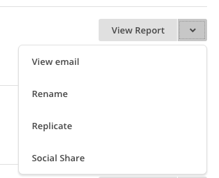
C. You can also view a report from the CAMPAIGNS menu. Next to each campaign you have sent is a button to view the report and an arrow to view the actual email, rename the campaign, duplicate it or social share it.
What’s on the report
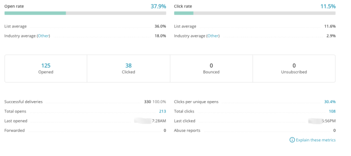
When you view a report you will see the name of the report, the date, number of subscribers it was sent to, and the subject line. You will also see the percentage of opens and clicks.
Under this data is a box that lists number of opens, clicks, bounces, and unsubscribes as well as exact details on when it was last opened and clicked.
There are some great details in this section that will help you understand how your campaigns are being received by your audience.
Moving down you will see a 24-hour performance graph showing when people opened your campaign.
This is very important for determining what time is best for your subscribers to receive emails. I send my reports very early in the morning so that it reaches my readers on the east coast before they go to work or start their day.
This also ensures the email is sitting in the inbox for my readers in other time zones as they wake up. I like to maximize on the fact they are checking their phones or other devices as they get out of bed.
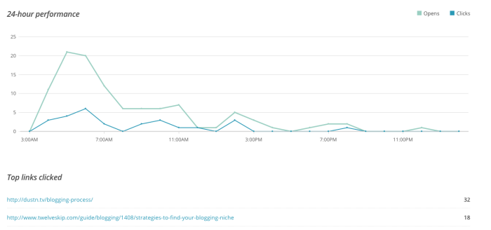
Below the graph are two important sections. The first tells you which link in your email has the most clicks and the next section tells you who is clicking around your email the most. It lists the emails of your top engagers.
Finally, the bottom two sections are for social performance and location. The social performance boxes will probably be zero unless you are sharing your emails on Facebook or Twitter. I do not do this so mine are always zero.
Except for the middle box. It says EepURL Clicks. This is the number of people who have received you email and then signed up for your list.
How does this happen you ask? Sometimes people forward your emails to others. For that reason, I always have a blurb somewhere on my campaigns that says
“If someone shared this email with you, please let me send you your own copy.”
I then include a link to my sign up form right on my newsletter or email.
It is not uncommon for my EepURL Clicks to have several new subscribers recorded. That is always a great number to see on my reports in Mailchimp.
The location report shows you which countries are opening your campaigns and in what percentage. You can even zoom in on your highest percentage country and see which states or districts had the most opens. Mailchimp also adds funny sayings to the details.
This is a fun report because it tells you what kind of readers you are getting. When I checked my last report I noticed I have mostly English speaking countries opening my emails however, in Canada most of my readers are from Quebec. I find that super interesting.
Reports can be informational and fun to watch.
What’s important on reports
As a blogger you focus on numbers. Numbers of comments, numbers of shares, numbers of subscribers. These numbers are important. But for email campaigns you want to focus not on subscribers, but on opens and clicks. This is a key element in your reports in Mailchimp.
Open and click rates tell you how engaged your audience is with your content. This is the most important part of what you are doing because it tells you whether your subscribers care about your content and the hard work you are doing.
If your open and click rates are low, you need to change it up. If you are sending RSS campaigns with low open rates, it’s probably time to switch to a newsletter to draw out more engagement.
Watch the numbers and make decisions based on what your reports tell you.
Digging deeper into the data
You can dig deeper into your report data by using the menu at the top of each report.

- Overview is what you see upon opening a report.
- Activity has a whole drop down menu of options to see who you sent the campaign to, who opened it, who clicked, and much more.
- Links breaks down each link in your campaign letting you know which ones were popular with readers and which ones were never clicked. This is s fun report to watch.
- Social, eCommerce360, and Conversations don’t need much, if any attention.
- Analytics360 works if you have set up your email campaigns with Google Analytics. You can see how to do that by clicking the blue link. What is interesting in this section comes further down, email domains. This information shows you what types of email platforms people are using to open your campaigns.
My most-used email platforms are gmail and other. This tells me I have a lot of users with self-hosted emails meaning, bloggers. That’s good because they are the group I am targeting with my campaigns.
Learning to navigate and read reports in Mailchimp is important because they give you benchmarks and help you set goals for your most engaged readers. People who are reading your emails are also reading your blog. Treat them well and you will be rewarded with comments, shares, and product purchases.
#YouCanDoThis






Debi, I use reports regularly and found them to be very useful. In fact, I have an app (official Mailchimp one) on Android which tells the dashboard of who opened and clicked on my email campaigns. I think MailChimp have really made this process simple and easier to understand for everyone.
There is a simple but useful Chrome app for MailChimp as well which tells the dashboard with one click on your browser.
Can’t praise it enough, I am in love with MailChimp. Thanks for writing in detail about this service. I am sure new bloggers will love it. Cheers, have a nice day.
Ahmad,
I love the app for Android. It’s so helpful to see who has opened your emails and how your content is being received. Thank you for taking the time to stop by and comment. All the best to you!
Thanks for writing this series Debi. I just got my first mail chimp account all set up thanks to your great tutorials! But my question is how do I turn off the automatic RSS emails that have been going out from WordPress? I don’t want people to get multiple updates each time I post. Thanks!
Lindsay,
Are you using JetPack to send out the RSS emails? If you are, there should be a place to unclick the RSS feed. If you are using Feedburner you will want to transfer your subscribers over and just use MailChimp.
Thank you for reading. Happy Blogging!!
Thanks for the tips! They’re very useful. You mentioned ” If you are sending RSS campaigns with low open rates, it’s probably time to switch to a newsletter to draw out more engagement”. What does this mean? Are you suggesting that usually RSS campaigns would have a lower open rate than newsletter campaigns? Could you elaborate on that?
Because this is exactly the issue I’m facing. We’ve been sending out this newsletter campaign and then switched to RSS with essentially the same content. The open rate dropped quite considerably. I suspect it might have something to do with the type of the campaign.
Herbert,
That is really interesting that your open rates dropped. I think part of the problem is also that you usually don’t get to change the SUBJECT field of an RSS feed. Therefore, people are just seeing the same thing from you and they have no incentive to open your campaign.
Newsletters have more “value” to readers. Plus, you can entice them to open the email with a great subject line. I definitely believe that newsletters are a much better way to interact with your customers and readers.
With a newsletter you can put in specific info for your readers while with an RSS campaign it is only what comes off your site and whatever you have put in ahead of time. There is much more customization with a newsletter campaign.
Thank you for your questions. I wish you the best.