4 Keys For Unlocking Blog Growth With Consistent Branding
Consistent branding can push your blog to new levels.
With consistency, your readers and followers begin to identify you with your brand. Your branding method may be a logo, a hashtag, a color scheme or a picture. It may be all of the above. Whatever you decide, make it consistent so that your audience can begin to connect with you across the web.
Create visuals that enhance the mood and tone of your writing. Use proper colors, textures, fonts, and space.
{UPDATED for 2020}
Simple branding
In its simplest form, consistent branding can be practiced by any blogger, even if you don’t have a professional logo.
Step 1 is to make sure you are using the same picture on every one of your social media platforms. Twitter, Facebook, Pinterest, Instagram, LinkedIn, and YouTube should all have a photo of you. A clear photo. Not a cropped, blurry or wacky photo.
Refrain from using a photo of you with your cat, in your bikini, or even your kids. This is about you. C’mon, it’s the one time in your life when you can turn all the focus on yourself and not feel guilty about it. Do it well.
If you want to be wacky – do it on your personal profile on Facebook, not on your LinkedIn profile. Oy!
Step 2 is to use the same colors and or picture in the background. Facebook, Twitter, and YouTube all allow you to use a graphic or photo behind your profile photo. Make sure it is consistent. If you decide to use your blog header – make sure it is clear, not fuzzy, that it fits properly in the allotted space, and that it looks professional.
Perhaps you need to forgo using your blog header and use another picture or color combination that complements your blog. It’s okay to do that.
No or low-Cost branding
So far, you need a clear photo of yourself and a complementary background picture or graphic. “But I want a professionally designed logo!” Great, go ahead. You can definitely go that route and I support you, as long as you don’t go into debt to do it.
However, if you can’t afford professional services, what are your options?
There are some great free and low-cost ways to create stunning graphics for free. They may take a little practice but don’t be afraid. Once you get the hang of it you’ll be off to the races.
- PicMonkey.com and Canva.com are the top two places on the web to create free graphics. If you don’t know how to use these sites, it’s time to learn. You can’t afford not to know how to create your own backgrounds and blog graphics with these tools. Seriously, if I can do it, so can you. I do recommend the paid version of PicMonkey (it makes a great birthday present) and be careful with Canva because while they have a ton of free options, each paid option is $1 and that can add up quickly.
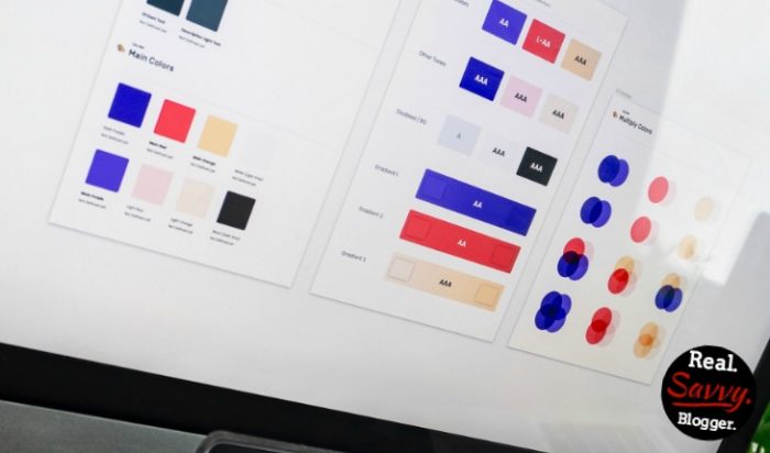
Color choices and branding
I have a thing for color. I love bright, vibrant colors but I love to read blogs with little or no color. It’s a conundrum for sure. I have written about the importance of color before.
The most important thing to remember is to choose colors that reflect you.
If I chose pastels for my blog I would hate it. It’s totally not me. But I love to read blogs with light, relaxing hues.
Think long and hard about your colors. Don’t pick them because of others, because your favorite blogger has them or because you think you have to do what everyone else is doing. Make your blog your own. Learn about colors, what they mean and how they can be used to engage your readers. Check out this Pinterest board dedicated to color.
Most of all, have fun. No one can see a rainbow and not smile, right?
Outside the box branding
There are some very classic examples of branding. Your favorite laundry detergent, soda or fast food restaurant all have a logo and colors you can identify immediately. Orange, blue, red, white, yellow, in the right combination you know these immediately. Fantastic! The company has done their job.
But what about regular old bloggers? How can you create a brand presence that leaves an impression but isn’t canned.
My fellow blogger, Regina at byRegina.com (now BetaAndBeyond) has done a masterful job at branding her graphics. When I see one of her pictures on Pinterest, I know immediately that it is from her. No doubt about it.
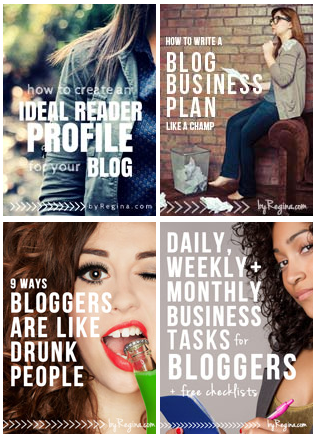
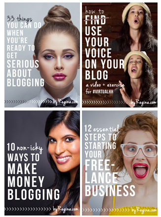
She uses consistent photos and images, the same font, colors and style to make her posts really pop. Can you see how they are creative but consistent? They really match her blog and her personality. But they have nothing to do with her logo. She is thinking outside the box and it totally works.
Another blogger who does this really well is Lisa Jacobson from Club31Women.com. Her pictures are not all the same, but they feel similar. Again, they feel the same and easily recognizable.
They uber-emphasize her content so that readers know, “Hey, that’s a graphic for a post from Lisa.” It’s not about her, but about her content. Over time it has created instant recognition.
You don’t need a $600 header or logo or photo shoot to create brand consistency. Perhaps someday you can invest in those things. But for now, use consistency and think outside the box. I can’t wait to see what you come up with.
Your blog is your main hub, but social media platforms are the spokes that radiate your message. Make sure they are consistent so that your audience sees you, not a picture of your feet at the beach and blurry fireworks and your last family reunion.
Consistent branding is the easiest way to jump to the next level with your blogging and it also lays the groundwork for lasting relationships with your readers.
It’s time to take it up a notch.
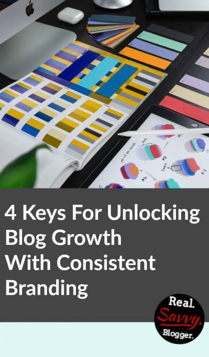

Photo by Balázs Kétyi on Unsplash






As usual, great information!! Thanks for your thoughts on this topic. I agree that we shouldn’t try to copy others just because they are pretty or we like them. We need to make our blogs show our personality in them so people will identify with us more. As for me…I’ll always have pink!!!
Thanks again for all your help.
Thanks sister. I LOVE that you will always have pink. It makes me feel safe that there are things I can count on in the world. Thank you for that. ROCK on!!
Thank you for these tips! I really need to work on consistency. I’m happy with my blog color scheme of 3 colors, but I would like to incorporate them in my new Origami Owl business. I added a page to my blog, but mistakenly did it in a hurry. I wanted to get something up quickly which is always a mistake :). This reminder has definitely encouraged me to redo my pictures on that page using my color scheme. Your examples from Regina are great. Basic, but not boring, and wonderfully consistent.
Thank you Candace. I really like Regina’s photos too. I appreciate you stopping by. I know what it’s like to do my work too fast. I’ve done that too. Have fun improving your page. You go girl!!
This was uber helpful, solid info! Thanks so much!
You are so welcome Sybil. Thank you for stopping by. I appreciate the feedback, for sure!
Thank you for the ideas. Branding is one thing I’m working on. I’m working on keeping a consistent layout to my posts. I’m not there yet, but getting closer. I think that is important too, that way your readers know how it is going to flow.
Excellent point Crystal. It is very important to let your readers find a comfortable spot to sit while on your blog. Consistency does that, for sure. Thanks for stopping by.
Great tips about consistent branding! It is definitely clear on your site what your color preferences are! I love it! I love that you incorporated “how to pronounce your name” info in your header. Brilliant.
Thank you Mindy. I appreciate you stopping by and leaving a comment. Happy branding!!