4 Non-Negotiable Blog Elements You Need To Have Now
I get a lot of questions about the elements of good blog design.
The truth is, you can have a great blog without spending a lot of money. So, what makes one blog good and another great?
Is it the template? The colors? The fonts? Maybe it’s the layout or the goodies in the sidebar.
No, it’s none of those.
Templates and color choices come and go. Fonts are like clothing trends. Here one season and gone the next. One bloggers ideal layout is another bloggers nightmare to read. No, it’s none of those things.
The elements of great blog design don’t change. They encompass the 3 or 4 things readers need to see on your blog, every time they visit. They are elements that need to be available for new and returning visitors, no matter what.
Remember, the window of time to keep visitors engaged is short – so how do you make the most of it?
With four non-negotiable elements.
Blogging has become a multi-million dollar industry and there are many ways to grip people who come to your site. Some are contrived bells and whistles. But some are pretty useful tools and there are a few elements that are non-negotiables.
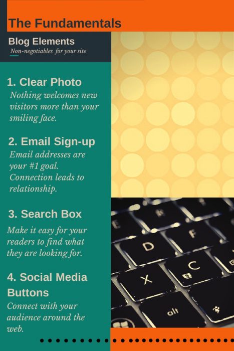
A clear, smiling picture of you
Readers need to see your beautiful, smiling face as soon as they get to your site. The old adage that a picture is worth a thousand words really is true. It’s important that readers and potential subscribers get a good feeling about you right away.
A clear, welcoming picture will mean the difference between staying and going. If your photo is in your logo or header, great! If not, make sure that a nice, focused, smiling picture of you is visible immediately upon opening your site.
You may have your photo linked to your bio but it’s okay to have an about me widget anywhere on your sidebar or even in your footer. Just make sure it’s great: short, informative, and inviting. I recommend working on this regularly, until you get it just right.
Whether your photo is linked to your bio or not, it must be at or near the top of your site for maximum impact. That also puts it in perfect position for your next non-negotiable……..
Email/Newsletter sign up form
Your number one goal as a blogger is to get email addresses.
Your Facebook likes, Twitter followers and Pinterest clicks are all secondary to getting those email addresses. When you have a reader’s email, you have direct access to their inbox – something they check everyday.
So, if you are going to make an effort anywhere, make it in this area. Make signing up simple, straightforward and worthwhile. Offer a free download or a portion of your ebook, anything that will reward readers for giving you their email. Then guard that thing like a member of Seal Team 6.
Don’t spam your list, don’t send them useless drivel. Treat them well and they will return the favor with likes, follows, favorites, retweets and pins. Make sure the option to sign up is right there at the top of your blog and at the end of every post. This truly is a non-negotiable.
I recommend:
Search button or box
I’ve been doing a little research on “search” buttons and their placement on some pretty popular blogs. I have to say, almost ALL of the blogs I visited, from the large to the minuscule had a search button very visible and very close to the top. In the few cases where I couldn’t find this treasure chest, I felt as lost as a small child in a big department store. “Where’s my mommy?”
Search buttons are the proverbial bump on a log in blogging. They aren’t particularly pretty and they don’t do much but sit on your page, most of the time. But when a reader is looking for something in particular – this little obscurity becomes invaluable.
Often, something I’ve written about comes up in conversation and instead of trying to rehash the whole post and remember the URL, I just tell people to search for a keyword. It works like a charm.
If your search button is in an obscure place or not high on your sidebar, do something about it. This is a great tool and you want your readers to have access to all of your posts. Make it happen.
Social media buttons
In the past, I was convinced that social media buttons were imperative above the fold. But I’ve changed my mind. When you get a reader to your blog you don’t want to send them away immediately. That’s exactly what social media buttons do. They take your hard-earned reader and give her or him an invitation to exit the building.
As my Nana would say, “That’s not very smart.”
Readers do need to know quickly and easily how to follow you. You definitely want to give them an option to see you in action around the web, but you don’t want to send them away just after they have arrived.
After much thought and consideration, my recommendation is to have buttons on your blog, but put them either in your footer or below the middle of your sidebar.
Successful bloggers are those who are building relationships with their readers. Do everything you can to keep your readers on your site. Get their email address, first and foremost, and then begin the process of cultivating a return reader, not just another “like.”
*UPDATE: I understand that some templates have built-in social media buttons at the top of the page. Whether your offer your buttons at the top or the bottom of your site, it’s all good as long as your visitors can follow you easily.
Social media can be a powerful tool for reaching new readers and helping you to establish relationships with first-time visitors. Have the buttons. Make them accessible. But remember your priorities. Content, readers, email addresses, relationships.
Maybe you’ve done all of these things already. Maybe not. It’s always good to review what you’ve got and make sure you are on target. If you want to learn more, I recommend this simple but insightful article at ProBlogger.
Do you have all the non-negotiables on your site?
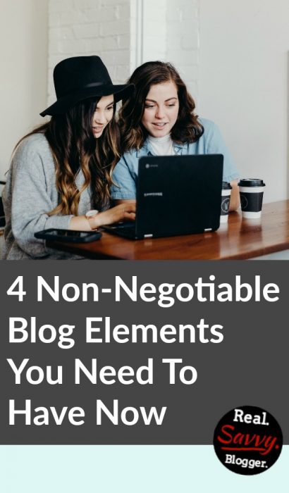
Photo by David Pisnoy on Unsplash
Photo by Brooke Cagle on Unsplash



Oh, Debi, so glad I found this post in your newsletter! I needed it… pretty sure I don’t have a search button and I KNOW my social media buttons aren’t on top. I want to make them all cute and matchy, but I have no money to invest
I have had a couple of online friends give some advice and even offer to help, but I’m an in-person type of girl. I don’t know how to tell someone I want without walking through the whole process in my head. I need a dedicated weekend to blog redesign side by side someone who knows what they are doing!
I hear ya, but I think you can do it. There is so much you can do on your own. And there is a lot you can do for free. Don’t let $$ hold you back. You don’t need to have major bucks to have a great blog. We can do this – together!! Love you!!!
I just went to my blog and made sure I had these on my sidebar! Thanks!
You are so welcome. Great job!
Playing catch up….:-) I have work to do! Thanks Debi
You can do it Richetta! I believe in you so keep moving forward. #YouCanDoThis
i have enjoyed the plug-in Ultimate Media Social Icon and Share Plugin. I changed to it after i read this post a few months ago. it moves down the page with the reader. it is off to the right, at least the way i set it, and is out of my way as i read the text, but is easily available when i need it. it is slightly faded out and has some color choices and shades that aren’t always available (always a plus for me!) i like that it isn’t shooting across the page like some and irritating me no end or stucke in just the spot where i want to see or read something. yes, it is on wordpress.
yes, i realize i have plenty more to do, but i am happy with where i am going.
Excellent Martha. I’m so glad to hear you’ve found some tools that are working for you. Thanks for sharing them with the rest of us. You go girl!!
Debi, while your points 2, 3 and 4 are straight forward and no-brainers, I am surprised to see the importance of the blogger’s picture on the main page as number 1. Honestly speaking, I think from the core of my heart, I want to believe this one. You are right, it is important to present yourself to your readers through a cheerful picture on the front so there is a sense of “life” in the blog.
Luckily I use a picture on my front page but I am not sure if it is a good one or not. At least it is not grim. I was thinking of removing it but after reading your article, now I am going to keep it. Thanks again for your experience shared with us. I am going to share it further with my readers.
Ahmad, the internet has the power to make us all invisible. But it is also a great way to build and maintain relationships, especially in business. A site without a picture leaves a reader wondering “Who is writing this?” “Are they 20-something guys in their basements?” “Is it someone with real experience?”
A photo takes a lot of the guesswork away. It created an instant connection and I believe it causes readers to stay longer on your site than if you don’t show your photo.
Thanks for stopping by. Definitely keep your picture!!
Hi Debi, found your blog through Pinterest. This is absolutely essential because a picture really does make an impression. One of my new favourite bloggers had a very stern looking picture, but she recently changed it to a more smiley one and it really makes a difference as to how you are perceived. Great post!
Thank you so much Humaira. I’m glad you found this post helpful. You are right that a good photo can really make a difference in how you are perceived. Happy Blogging!