Oh, you are so close to sending your first Mailchimp RSS campaign by email. This is exciting.
In our last lesson we made it as far as choosing a template for your email. Let’s complete this creation process while we also learn about some of Mailchimp’s amazing design tools for customizing your campaigns.
Want to see the whole series? Check out Mastering Mailchimp.
{Updated for 2019}
Get logged into your Mailchimp account and make your way to the CAMPAIGN section.
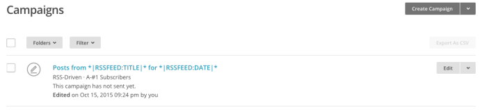
You started an RSS campaign in our last lesson so you should see this sitting right on your campaigns homepage. It looks like this
Click the EDIT button on the right side. You will be taken to the design center where we left off last time.
Welcome to the template design center in Mailchimp. We are creating a plain RSS template.
There are a lot of parts to this screen. None of them are difficult, trust me. They probably look confusing right now, but as you play around and create more campaigns this screen will become old hat. I know you can do this.
Let’s start with a small review.
In the top gray bar you will see the Mailchimp logo. This will take you back to the dashboard at any time. Next to this is the name and title of the campaign you are working on. For an RSS campaign it has funny merge tags and language. Have no fear. This is perfectly normal.
At the bottom of your screen in another gray bar you will see the BACK option, the progress bar, and the NEXT arrow. You can click any of these during the creation of your campaign.

In the top right corner are some new options we will talk about in just a bit. For now let’s move into the white section of the screen.
On the left is a preview screen of what your campaign looks like to your subscribers. On the right is the editing area.
At the top of the editing section you will see three options CONTENT, DESIGN, and COMMENTS. The section you are working with should be highlighted in light blue. As you can see from the graphic above we are in the CONTENT section.
Move to the DESIGN section by clicking on it.
Design
We are starting with the design section because for each template you create you should only need to enter this section once, to choose the colors, fonts, and overall design features of your template.

As you can see there are a lot of choices here. Each section of your template is fully customizable. You can choose to change everything, nothing, or just a few things. It’s up to you.
We are not going to discuss each section one-by-one. We will however go over one section, PAGE, then you can use the same principles in each of the other sections.
As much as possible, establish your design before you enter your content. You may need to come back and tweak a few items when you start inputting your content, but it should be relatively small changes you need to make.
Okay, let’s get started. Remember, this is a play-as-you-go lesson, so try lots of different things to see how everything looks.
You should now be in the PAGE DESIGN section.

Start by scrolling to the bottom. There are a lot of options aren’t there? We will touch on just a few here.
Background
The first option is to change the background color. Click the box and either choose a color or input your own hex code. If you need help with hex codes try using this handy tool.
Try a few colors and see how they look.
Borders
Next, are some options for borders. I don’t recommend borders but if you like them, add them. You can choose which type, the weight in px, and the colors.
Try them to see how they look.
Headings
The rest of this design page is dedicated to headings. H1 – H4 are your options. You can change the color, font family, size, style, and weight, and the line height. You can also change the letter spacing and alignment.
Remember, these options will change the heading size for every H1-H4 heading on this template, so choose wisely. Go ahead and play around so you can see how each item looks.
As you make changes they will show up in the left preview pane so you can see your changes in real time.

CHIMP TIP
Keep your readers in mind as you play with font sizes, styles, and colors. Many people read emails on their mobile devices. Make sure your text is easy to read. Too many colors or crazy fonts will drive subscribers away.
It is now time to play with all of the other sections one-by-one. Be sure to save your work when you have it just the way you want it.
This part of your template creation is all about trial and error. See what works and what doesn’t. You can’t know what is best until you play around in here.
A word about Mobile: Leave the mobile section as is. You can tweak it later, if necessary.
Preview
Before we move forward look in the upper right corner of your screen. In the gray bar you will see PREVIEW AND TEST. The arrow next to the text will give you a drop down menu with several options. At anytime during the creation of your email or newsletter you can use this section to check your work.

A. By clicking the ENTER PREVIEW MODE you can see how your email will look to your subscribers on desktop and on mobile. This is a handy tool to use, especially before you send your first campaign.
B. The SEND TEST EMAIL option allows you to send yourself a copy of your campaign or to someone else because HTML looks different in different email programs. However, you only get a limited amount of test emails sends in a 24-hour period.
You should be able to use the PREVIEW MODE quite effectively to see how your emails look and not need to use the TEST EMAIL option more than a few times.
This option is good for teams who are creating campaigns and need to see what each other is creating. If you are a single blogger you probably won’t need this option after your first or second campaign.
C. PUSH TO MAILCHIMP MOBILE allows you to see how your campaign will look on your phone. You must have the Mailchimp app on your phone and push notifications enabled to use this. As a beginner, you won’t need this too often.
D. You are of course free to use the OPEN LINK CHECKER. However, it is rather time consuming and I find it easier to just enter PREVIEW MODE and click all my links from there to make sure they are working properly. It’s faster.
E. Another option you probably don’t need to use is SOCIAL CARDS. This is Mailchimp’s way of showing off your campaigns on Facebook, Twitter, and Pinterest. As a beginner, you are free to set this up if you’d like, but it’s not mandatory.
Finally, RUN BOX INSPECTION is available to monthly subscribers and pay-as-you-go customers of Mailchimp. That’s not you, so no worries.
Comments
Back in the right pane you’ll see the COMMENTS tab. This is for businesses who use a marketing team to create and produce their email campaigns. Teams can discuss content and design using this comment section. As a single blogger, you don’t need to worry about this option.
Excellent job getting this far. We’re ready to move on to the CONTENT section but you have a lot to do. You need to design your template by choosing colors, fonts, and backgrounds. When this is done we can move on to creating the content in the body of your email.
We will pick this up in our next lesson.
Spend some time playing around with what we’ve covered in this lesson. See how everything works and be sure to save your work. When you are finished SAVE AND EXIT in the upper right corner. We’ll start right back here in our next lesson.
I commend you for sticking with this. I know it’s a lot to take in, but as I always say…
#YouCanDoThis

Leave a Reply