Offer Your Readers Helpful Mailchimp Confirmation Emails
Do you love your new Mailchimp signup form?
In our last lesson we talked about how to design your signup form. This is the form your subscribers will see when you send them to your unique email list URL (which we talked about in a previous lesson. See the whole series if you want to Master Mailchimp.)
Now it’s time to design your other forms. These are actually Mailchimp confirmation emails that will get subscribers onto your list.
{Updated for 2019}
When a subscribers signs up for your email list, they will be sent several emails to confirm their subscription. One thanks them for signing up and let’s them know a confirmation email is coming. The next email asks them to confirm their subscription. The final email is the “thank you” email for joining your list. It’s also a special email that we’ll talk about a bit later.
Your job right now is to get signed in to your Mailchimp account and over to your signup forms homepage. Here’s a short video if you don’t remember how to do that.
Congratulations! You made it.
After you have created your initial signup form, the styling you have used will carry over onto all of your other forms. You won’t need to recreate any of the color, header, or fonts. This is great news.
What you will need to create is some original text. Remember, you have access to the Build It, Design It & Translate It tabs for any form you edit. You can make all the changes you want BUT any changes you make to the background, header, or font will be applied to every form associated with your list.
First, let’s look at which forms you need to be concerned with as a beginner who is mastering Mailchimp.
When you click the gray bar in the Create Forms section of your list you will see a dropdown menu with a lot of choices. Don’t worry. You don’t need to touch 75 percent of these forms. As a beginner, we are going to focus on the top six forms.
Yes, I know there are seven forms in the Subscribe section, but we only need to use six of them. We completed the first one in our last lesson. Now, we’ll move on to the final five forms.

Signup with alerts
Click on Signup form with alerts. Scroll down to see what your form will look like if a subscriber fails to enter data into required fields. You can change the color of the alert in DESIGN IT – FORMS – REQUIRED.
Changing the color should be all you need to do on this form.
Signup “thank you” page
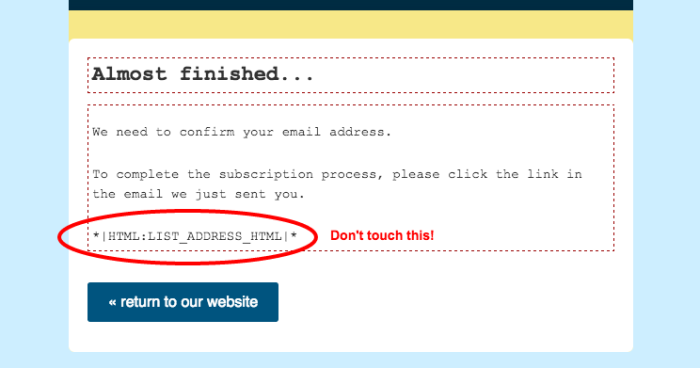
This is a page you can personalize. Change the colors of the font, if you wish, add a personal message to thank subscribers for signing up. Just don’t touch the merge tags on this page. These are very important to get the right people to the right list.

Subscribers will get an email with this form after they have signed up, but before they have confirmed their subscription.
Feel free to leave this as is if you do not wish to mess with it.
Opt-in confirmation email
This is the email that seals the deal. When a subscriber clicks on the “Yes, subscribe me to the list” button they will be added to your list.
For beginners, I recommend leaving this page as-is. You may want to change the color or style of the font to match your branding, but leave the wording as it appears.
Opt-in confirmation CAPTCHA
This screen is optional. If you have chosen to require CAPTCHA for your subscribers, they will receive this email. If you have not chosen this option they will never see this.
You can select this option from the Signup Form (first option on the gray dropdown menu.)

Confirmation “thank you” page
This is where your Mailchimp confirmation emails become useful to your readers. This is where you introduce them to all the great posts, products, services, and insights your blog has to offer.
There are two options for sending out the confirmation “thank you.”
Option 1: Customize the Mailchimp form
Create a message for your new subscribers to welcome them to your blog. Give them access to your freebie (we’ll be talking about this soon), direct them to your start-here page, invite them to follow you on social media, and let them know you are glad to have them on your list.
The edit box is easy to use. You can change the color of your fonts, make fonts larger or smaller, add graphics, and create links to your blog and social media accounts.
Your goal with this option is to make this email extremely helpful. Tell your subscribers exactly where you want them to go. Thisis your one chance to get more followers on social media and pageviews on your blog.
Option 2: Create a thank you page on your blog
For your main email list, this is the best option. You can create a welcome page on your blog to get new subscribers right to your site. Like the option above you should direct them to posts and information you want them to see, as well as to your social media accounts. Like before, you can offer them your freebie and direct them around your site.
This option is more beneficial than the Mailchimp form because it gets you a pageview every time. By directing new subscribers to the URL for your welcome page they will count as a visitor to your site. Ding ding! This is a win for you.
When you create your welcome page you paste the URL of that page into the box right below the design tabs. Be sure to save it.

This URL will be private and only available to new subscribers as long as you do not add it to your menu. No one knows it exists except you. Pretty stealth, eh?

CHIMP TIP
If you don’t have a welcome page designed on your blog yet, use the Mailchimp form. It’s a perfect temporary fix until you get the page on your blog designed. As soon as you finish your blog welcome page, go back into Mailchimp and enter the URL in the appropriate box. Mailchimp will begin to direct subscribers to your blog.
There you have all the forms you need to get started building your list on Mailchimp. Spend some time designing your forms so they reflect your style and your blog. Branded forms create a professional look and convey to readers you know what you are doing.
#YouCanDoThis

[mc4wp_form id=”11788”]


Woo hoo! It’s shaping up! But I didn’t know you could create a secret page on your blog so only certain peeps could access! I’m super pumped, but I tried that and now I can’t access it either (except in admin) in order to copy and paste the URL. I just asked this question in Big Idea but I’m working on it right now so thought I’d try here as well…
I hope you got this figured out. You link to any non-public page by using the URL. Great job!
Do you have to have the opt-in confirmation? Or can you just do a single opt-in without confirmation? I sometimes subscribe and then get annoyed when I have to open another email and confirm. I realize it protects against false sign ups, but also creates another step for users…
Hi Adriel:
You can definitely do a single opt-in. I would recommend you try it and see how it goes. If you start to get a lot of bogus subscribers you can add a double opt-in. One of the reasons for keeping out fakers is that eventually it gets expensive. When you reach the 2000 subscribers on the free plan you want to make sure they are real, not just bogus emails. You go girl!!
Ok, thanks. I actually spent the day setting up some new lists on mailchimp and couldn’t find how to opt out of the double opt in. I can google is later to see where I’m missing something. But for now, at least it’s set up better than it was before. Can’t say I love doing all the back-end/technical stuff!
So, to change the double opt-in in MailChimp you have to do some recoding – MailChimp isn’t too keen on this. However, if you use a third-party app you can use a single opt-in option – as in SumoMe or OptinMonster.
Thank you so much for your great tutorials Debi! I have just finished reading and following along to this point and everything is working perfectly so far. I am offering a free quilt pattern and the secret page is perfect!
Thank you so much for your feedback Connie. I’m glad you have found this series helpful. And I’m thrilled to hear it all works. You go girl! Happy blogging.