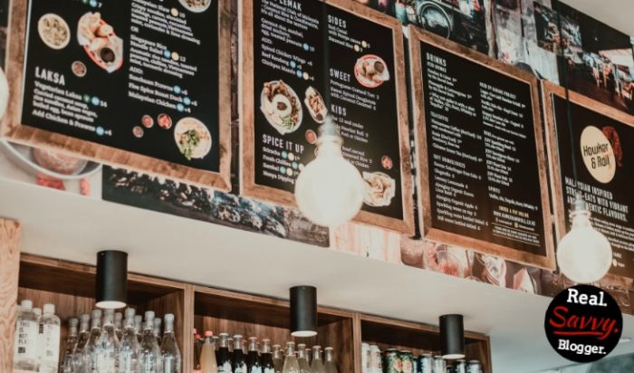
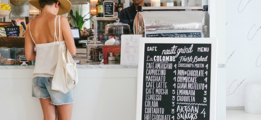
Give Your Hungry Readers A Great Menu
Have you ever eaten at a restaurant with a terrible menu?
If you have, then you know it can wreck your meal. When you go in to get some much anticipated sustenance only to be left wanting when you are handed the list of fare, it’s more that disappointing. It ruins the experience. The food could be really good, but you’d never know it from the paper and plastic you’ve been handed.
This post is now available as part of a full ebook.
“Delicious Blogging” comes complete with 31 lessons, action-steps, and a companion workbook. You will quickly and easily learn how to blog.
Get your copy today and start creating a blog readers will love. BUY NOW
The menu is the diner’s gateway to satisfaction in a restaurant.
Your blog menu is the the portal by which your readers find sweet satisfaction on your blog. If they can’t get around, what’s the point?
Menus are the often overlooked but oh so important section of your blog that can make or break turning a new visitor into a return customer. If a reader comes to your site it means they are hungry for something. Give them a great menu and they will be sure to come back for more.
Without a well organized menu you have no chance of developing a relationship with a new visitor. So it’s important that you design it with care and consider your reader first as you place each element.
A well-designed menu should have several parts that work well with each other.

Here are the non-negotiables for a menu:
Home
It seems like a no brainer but you really do need a way to get “home.” Add this simple item, even if your header leads people back to your front page. Most readers are savvy. Some are not. Make it easy for everyone, even your grandma.
About
This is the most visited page on a blog. You must have one. It needs to be good. If you missed my thoughts on this check out my recommendations for your About page. This is a key ingredient in your recipe for blog success. Don’t skimp here.
Contact
I talk about this extensively in Chapter 9 of Delicious Blogging, but for now you need to know that a contact page is critical. One of the most important reasons, that most new bloggers overlook, is this is a way for sponsors to contact you. It is also how sites, who would like to invite you to guest post, can reach out to you. Don’t leave them hanging and miss out on opportunities. Hello?
A contact form or page is also a great networking tool. Readers who want to dig deeper can have access to you on your terms.
Categories
In a previous post about sidebars I said to ditch the tag cloud. Absolutely, do it. But, be sure you are listing your categories on your menu. We will talk more about these in this categories post, but right now you need to know that a) your readers need to see what you write about and b) these need to be very clear. Don’t use cutesy names. I know it’s tempting but just use regular words, not metaphors.
If you have a drop down menu on your theme use it. If you don’t but can use two menus, like a top and a bottom menu, use them.
If you don’t have either of these try to refrain from using a double layer menu. It’s not your best option. Usually, if you only have one menu, you can create a second one in your sidebar. Do this below the fold.
Even if you have to code it yourself, get help and put things like your privacy policy, your resource page, and your extra pages in the sidebar.
Your primary menu should contain items like:
Home – About – Contact – Categories – Products
Arrange them how you choose, but keep it really simple.
Your secondary menu should be:
Categories – Start-Here / Welcome – Email List – Extra Links
Again, arrange how you want, but keep it simple.
Finally, your menus should make sense. Ask a friend or better yet your mom to go to your site and start poking around. How is it for her to get around, figure out the purpose of your blog, and find things? Is it organized or confusing?
These are the things you need to know. Don’t leave new visitors hanging. Gently guide them to exactly what they are hungry for using your menus.
Is your site easy to navigate?

Photo by Sunrise Photos on Unsplash
Photo by Jason Briscoe on Unsplash


